
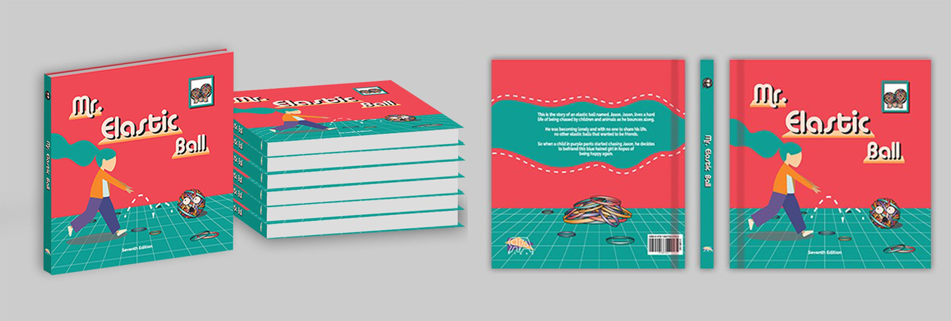
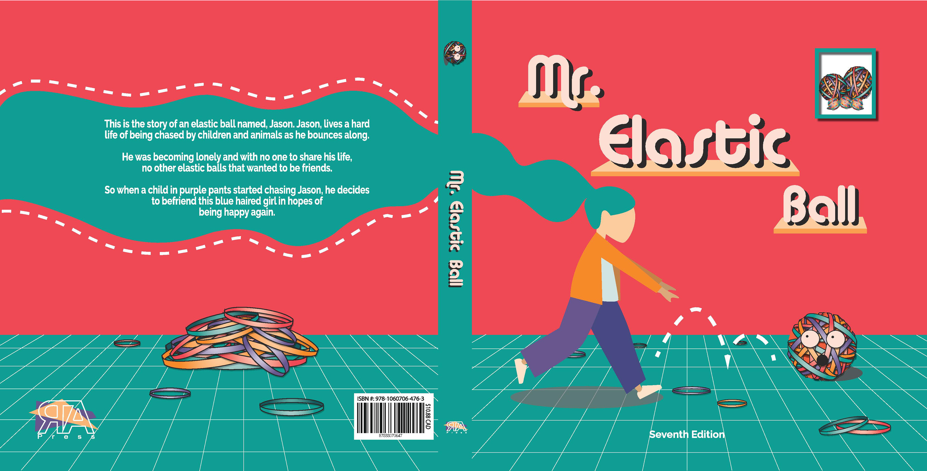
This is an illustration spread for a child’s book cover called Mr. Elastic Ball.
Audience:
The target demographic I had in mind when creating this child book cover, was for children between the ages of 5-8 years old, as the characters are more realistic and use bold colours to attract their attention. The genre of this novel is a nonfiction narrative or a typical child novel that tells an important message.
Logo Inspiration:
For my logo design, I took inspiration from the 80s and 90’s logo design style from the site that was given. It was also described as a Memphis design. This is something that is quite trendy right now in graphics. As I was creating the logo, I was thinking of ways to merge the letters, RTA together to make it smaller and more concise on the back of the novel. In order to do this, I took inspiration from the minimalist trend of lines/ strokes on the text which is seen in many of the designs from the 80s and 90s. Many of the colours that I used throughout my design were also consistent with the theme of vibrant and bold colours. This style is also used throughout my novel cover design with geometric and bright colours so using the same logo design fit in nicely.